 ‘Four things to see’ is sponsored by Bloomberg Connects, the free arts and culture app. Bloomberg Connects lets you access museums, galleries and cultural spaces around the world on demand. Download the app here to access digital guides and explore a variety of content.
Each week we bring you four of the most interesting objects from the world’s museums, galleries and art institutions, hand-picked to mark significant moments in the calendar.
The conceptual artist On Kawara died 10 years ago on or around 27 June – the precise dates of his birth and death are not known, but he is generally thought to have lived for 29,771 days. This factual quirk is rather fitting: perhaps the best-known of Kawara’s contributions to art is his Today series, or ‘Date Paintings’ (1966–2013), which transformed renditions of that day’s date from mere records of timekeeping into contemplations on time and existence.
To commemorate Kawara’s legacy, we dive into the rich and growing field of art and data, where artists draw on records, facts, figures and big data for their inspiration, source material or form. From executing intricate visualisations to conceiving thought-provoking installations, these artists navigate the intersection of art and information, transforming seemingly dry data into captivating forms of expression.
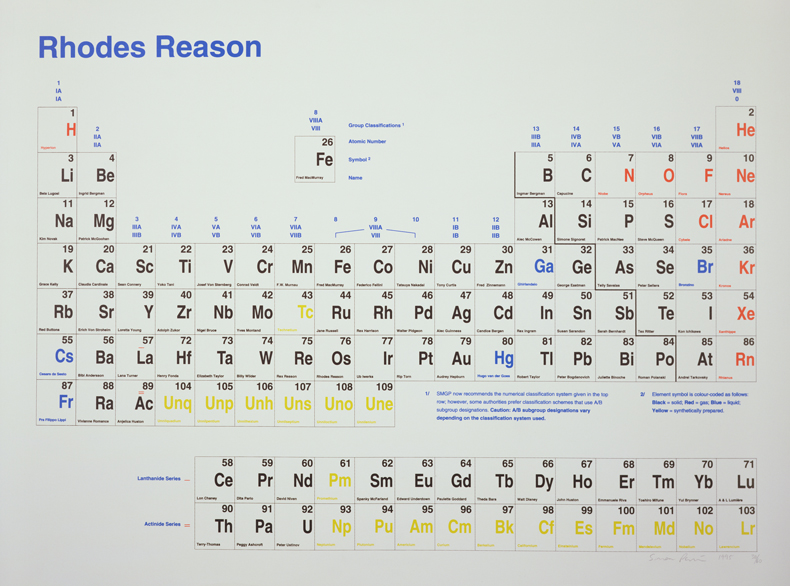
Rhodes Reason (1995), Simon Patterson. Aldrich Contemporary Art Museum, Ridgefield, Connecticut

Rhodes Reason (1995), Simon Patterson
Aldrich Contemporary Art Museum, Ridgefield, Connecticut
The English artist Simon Patterson is perhaps best known for his work The Great Bear (1992), a print that reworks the London Underground map by replacing Tube stops with the names of famous individuals. In Rhodes Reason, he continues this fascination with the diagrams we use to order our world, this time reconfiguring the periodic table and replacing the expected chemical elements with names from myth, history or popular culture, gesturing at the innate human desire to establish order and meaning through heroic narratives. Find out more on the Bloomberg Connects app by clicking here on your mobile device, or by scanning the QR code at the bottom of this page.
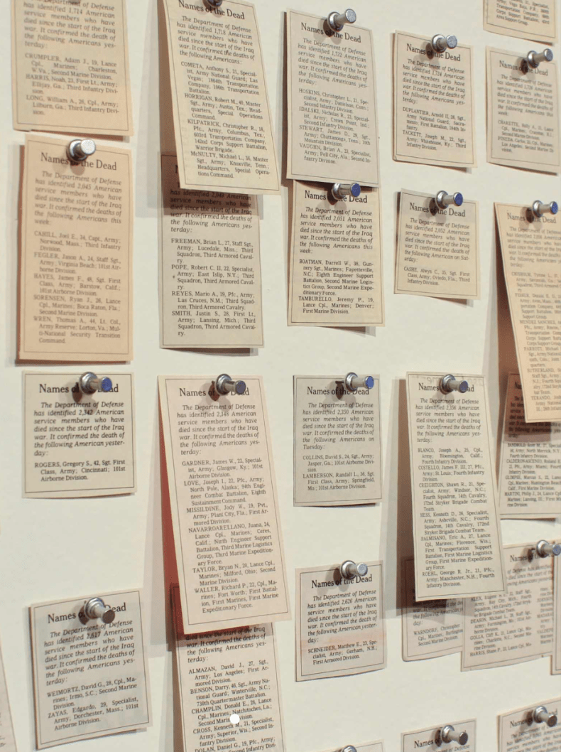
Names of the Dead (2006–10), Carlos Aguirre. Museo Universitario Arte Contemporáneo (MUAC), Mexico City

Names of the Dead (2006–10), Carlos Aguirre
Museo Universitario Arte Contemporáneo (MUAC), Mexico City
Carlos Aguirre’s Names of the Dead confronts the death toll of the Iraq War by meticulously collecting obituaries of fallen US soldiers. The installation of 1,139 newspaper clippings, all taken from the New York Times, challenges the official discourse, transforming data into a poignant anti-war protest. Click here to read more.
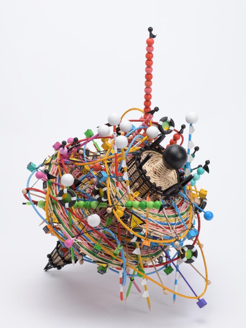
Spinning towards a New Normal (2022), Nathalie Miebach. Museum of European Cultures, Berlin State Museums

Spinning towards a New Normal (2022), Nathalie Miebach
Museum of European Cultures, Berlin
Nathalie Miebach’s sculpture translates data into a tangible form through weaving. In dyed rattan, textiles and wooden beads, Spinning towards a New Normal spins intricate patterns from statistics relating to the Covid-19 pandemic in Germany, Italy and Spain. By braiding materials based on infection incidence rates, deaths and vaccination numbers, Miebach transforms abstract data into a visual representation of the pandemic’s disorienting impact on society. Click here to discover more.
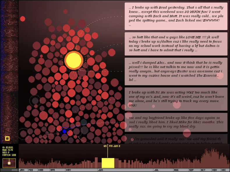
The Dumpster (2006), Golan Levin. Co-commission by Tate, London and the Whitney Museum of American Art, New York

The Dumpster (2006), Golan Levin
Tate, London / Whitney Museum of American Art, New York
Created by the artist Golan Levin in collaboration with the programmers Kamal Nigam and Jonathan Feinberg, this internet artwork visualises the emotional landscape of heartbreak by analysing blog posts by North American teenagers. The months of 2005 appear along the lower axis and nodes representing 20,000 heartbreaks appear on the left vertical axis. Through interactive visualisation, it transforms raw data into a compelling narrative, revealing the universal experiences of love and loss amid the vast landscape of the internet. Click here to find out more.
![]() ‘Four things to see’ is sponsored by Bloomberg Connects, the free arts and culture app. Bloomberg Connects lets you access museums, galleries and cultural spaces around the world on demand. Download the app here to access digital guides and explore a variety of content or scan the QR code.
‘Four things to see’ is sponsored by Bloomberg Connects, the free arts and culture app. Bloomberg Connects lets you access museums, galleries and cultural spaces around the world on demand. Download the app here to access digital guides and explore a variety of content or scan the QR code.


