A very happy dog trailing a line of wet paw prints was leaving the new Serpentine Pavilion at the heels of its mildly embarrassed-looking owner as I was entering. Just through the entrance is a very shallow pond that runs the width of the main room and is deep enough for you to walk in without getting your feet too wet, unless you’re wearing sandals. The pavilion has been designed by Mexican architect Frida Escobedo, who, at 39, is the youngest architect yet to take on the commission.
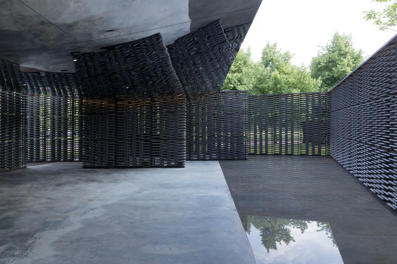
The shallow pond marks the part of the pavilion not directly covered by the convex mirrored ceiling that runs across the rest of the main space. It receives the kind of slightly confused response from visitors that anything not on a wall or behind a rope in an art gallery tends to receive: Can I walk on it? Poke it? Sit on it? If I let my child splash in it will I be shamed on social media…?
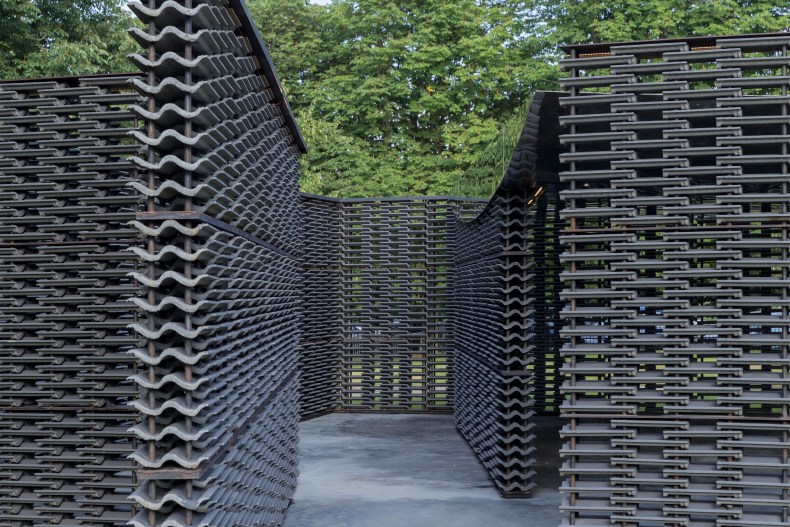
Serpentine Pavilion 2018, designed by Frida Escobedo, Serpentine Gallery, London. Photo: © 2018 Iwan Baan; © Frida Escobedo, Taller de Arquitectura

The floor beneath the water is polished, reflecting light upwards as the ceiling reflects it down into the space. As well as providing Instagram-friendly surfaces the extra light helps create a contrast with the interior: the floor is grey, the walls are grey and the mirrored ceiling reflects mainly grey. Perhaps on a brighter day than that of my visit the play of light will be more changeable. Escobedo intends the building to be ‘a timepiece that charts the passage of the day’ and some of the walls are also aligned to the Greenwich Meridian Line – these sit at a slant to the other walls and create sharp corners on some of the sides of the structure.
The walls that surround the pavilion and divide the main space from two smaller side rooms – one of which holds a bar – are made of stacked roofing-tiles, specially made for fitting on to the poles that link them. Between each tile is a gap, about equal to the thickness of a tile so, once inside, you can catch glimpses of the green of Hyde Park and, if you are outside, you can glimpse the people moving around inside. The walls, or celosias, are a feature of building in Mexico, intended to let a breeze through as well as providing shade. The slits in the walls here, however, do little to break up the grey, although they do sometimes allow you to see through to another grey wall behind.
Serpentine Pavilion 2018, designed by Frida Escobedo, Serpentine Gallery, London Photo: © 2018 Iwan Baan; © Frida Escobedo, Taller de Arquitectura

Peter Zumthor’s Serpentine pavilion in 2011 was similarly dark on the outside, but it also contained a garden that formed a welcome contrast with the austere exterior. Zumthor also provided visitors with a place to sit, the idea being that the garden was a contemplative space within the solid walls. Escobedo’s pavilion will only have seating when an event is happening.
This year’s pavilion feels more like a space for serious discussions about architecture and art and less like a space for celebrating summer than some of its predecessors have been. I expect most visitors will wander through and stop for a photo or two before heading out to enjoy sitting in the park beyond. When summer is over and the pavilion has been sold, and makes its way on to a large estate or parkland, if plants get the chance to wind their way up the tiled walls, I suspect it will become a very pleasant spot. Some of this will, hopefully, be allowed to happen over the next few months.
The Serpentine Pavilion at the Serpentine Gallery, London, is open until 7 October.


