The varied career of the Italian artist Mario Schifano (1934–1998) saw him experiment with painting, collage, photography and video, constantly changing his style as well as his media. A new exhibition at Luxembourg & Dayan focuses on seven years in which his incessant metamorphosis was its most pronounced.
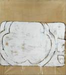
Schifano is often associated with Pop Art due to his use of the Coca-Cola and Esso logos in his mid-1960s work, but this small exhibition brings together key examples which show what came before and after. At the start of the ‘60s Schifano found success with his large monochromes and abstract forms, which attracted the attention of the dealer Ileana Sonnabend. Despite the experimentation with flatness and depth, these canvases are quite unlike colour field painting; his gestural and dripping enamel paint is more reminiscent of Jasper Johns and Robert Rauschenberg. Schifano’s use of cheap canvases, which he covered in parcel-paper, creating a grid-like effect and an uneven surface, is indicative of his early material experimentation.
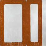
This loose gestural aesthetic continues into Schifano’s Pop pieces, but he moved smoothly from abstraction to more figurative subjects. In 1962 Schifano’s work was included in ‘The New Realists’ exhibition at the Sidney Janis Gallery in New York, alongside Andy Warhol and Roy Lichtenstein. While Schifano’s subjects are often similar to Warhol’s, his approach is quite different. His car crashes, such as Incidente (1963) are infused with dynamism, not morbidity, and his copied logos are sketchy and cropped. Schifano’s brand of Pop is closer to that of Richard Hamilton than his American contemporaries. In these years, Schifano’s use of Perspex, a material which shaped Italy’s post-war reconstruction is particularly interesting. Before affixing the translucent coloured Perspex to Propaganda (1965) and Plastica (Paesaggio con Brancusi) (1965), he used the simple geometric shapes as stencils to create repeating forms, which give a sense of dynamism.
The translucent Perspex obscures the painting beneath to an extent, but in 1966 Schifano began to use textured Perspex to diffuse his images further. This, combined with the use of spray paint effectively loses the artist’s hand, but he’s not lost altogether as the rather kitsch palm tree subject of Tutte stelle + particolare dell’oasi (1967) reflects Schifano’s childhood in Libya. This use of Perspex, so different from the 1960 monochromes, not only demonstrates another radical shift in Schifano’s oeuvre, but also pre-empts his later interest in painting television screens.
While the exhibition showcases the changes in Schifano’s style over a short period, signs of continuity are still apparent: his loose brushstrokes, unusual materials, motifs which display and conceal the canvas, and preference for certain colours, in this exhibition cyan and terracotta. Throughout the period Schifano also succeeded in synthesising many aspects of European and American modernism, while resonating with the concerns of post-war Italian art; his experimentation with materials and reflection of Italy’s post-war social and economic changes are shared with the artists of Arte Povera as well as Lucio Fontana and Alberto Burri. Given the recent popularity of such artists in London, Schifano’s star should also be rising.
‘Mario Schifano 1960−67’ is at Luxembourg & Dayan, London, until 16 August 2014.
Related Articles
Review: Lucio Fontana at the Musée d’Art Moderne, Paris (Emma Crichton-Miller)
‘La Bella Figura’ at Max Wigram Gallery (Rosalind McKever)
Review: Pablo Echaurren at the Estorick Collection (Rosalind McKever)


