From the November 2023 issue of Apollo. Preview and subscribe here.
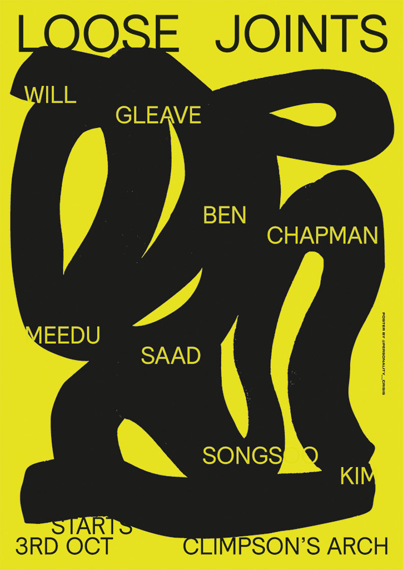
More and more, a restaurant isn’t just a restaurant: it’s a place where food and wine intersect with off-beat music references and increasingly elaborate graphic design. In September, the chef and restaurateur Ben Chapman posted on Instagram about a series of dinners he was organising at Brat x Climpson’s Arch in east London. The series was called Loose Joints, a nod to the early 1980s New York experimental disco outfit of the same name, and would feature dishes by Chapman and Will Gleave alongside fellow chefs Meedu Saad and SongSoo Kim. Chapman’s post came with an ‘artwork’ by Rusty O’Shacklewell, a graphic designer who started out making posters for gigs and music festivals but has gravitated towards the food world, which now has a voracious appetite for talents such as his.
You may have noticed this over the past few years if you’ve frequented a certain type of restaurant or wine bar in the East End – or Manchester, or Leeds, or any buzzing food scene in the UK. Where once a graphic designer was hired to mock up a restaurant logo, or maybe lay out the menu, now their stamp can be seen all over the walls, as well as on social media – and in customers’ homes.
This has coincided with the trend among restaurants for spicing up their everyday operations with special events. A hyped chef from Hong Kong is cooking for a night? A cult winemaker from the Ardèche is visiting with a clutch of new vintages? The self-evident response, now, is to advertise the event – and commemorate it afterwards – by commissioning a poster and hanging it on the wall. These posters are often genuinely striking, with jazzy typefaces, eye-popping colours and glitchy visuals, but over time they’ve become a style marker as obvious as tungsten light bulbs in an east London speciality coffee shop.
Restaurant owners patronising the visual arts is nothing new. At the Colombe d’Or in Provence, Matisse, Miró and Chagall would trade artworks for a bed and a few hot meals. In London, the River Café has cultivated an arty clientele who have reciprocated with paintings and menu designs, while Damien Hirst and Carsten Höller, among others, have gone as far as creating restaurants of their own, with varying degrees of success.
The trend for event posters, however, is a more recent phenomenon. It’s hard to pinpoint where it all began, but a pioneering example is the work of Tegan Ella Hendel for P Franco, a legendary wine bar in Clapton, east London, which shut its doors in March. By happy coincidence, P Franco’s manager at the time, Phil Bracey, was in a relationship with Hendel – so when he started showcasing winemakers at the bar in 2015, and later hosting chefs, Bracey could call on her to create a poster at short notice.
Poster designed by Rusty O’Shacklewell for Loose Joints, a series of dinners held at the London restaurant Brat x Climpson’s Arch in October 2023. Image: © @personality___crisis

‘Very short notice,’ says Hendel, when I call the couple at their home in Melbourne, where they relocated a couple of years ago. ‘Phil would say: “Can you do me a poster in 24 hours?” I’d say: “Yeah I can, but you can’t change it if you don’t like it.”’ According to Hendel, these tight turnarounds shaped the aesthetic: blocks of colour, weird type- faces, clear messaging with words bisected or reversed. ‘I didn’t have photographs or illustrations, just typography and bright colours,’ she recalls. ‘In the end, those limitations became such a beautiful part of why [the posters] were dynamic.’
Hendel’s designs – just as much as its adventurous wines and its countertop chefs – were a key element in why P Franco became a cult hit. Though the bar and its sister restaurants Peg and Bright no longer exist, their posters – Hendel produced more than 200 in total, selling prints to customers on the side – live on in people’s homes around London and far beyond. (I’ve seen P Franco posters crop up in remotest Connemara.) They also triggered a flurry of imitations, some paler than others. ‘I’ve definitely had people send me messages saying: “This looks like a poor-man’s version of a Tegan poster,”’ Bracey says.
‘It is harder to be original,’ admits Hendel, who continues to design posters for London restaurants such as Brawn and Cadet. ‘Especially with typography. Typographic posters have become standard. I don’t think we were solely responsible for that, but now I feel very cautious about doing anything close to that.’
Happily, other visual artists working in this niche are accepting the challenge and running with it. Where Hendel’s designs tend to be clean and economical, Rusty O’Shacklewell embraces psychedelic excess in his work for Super8, the restaurant group of which Brat x Climpson’s Arch is a part. His poster for Loose Joints is relatively restrained, with a thick black line contorting against a yellow background, overlaid with the names of the participating chefs. Other more out-there examples reference Tropicália, Jodorowsky movies, and the memorably freaky Polish and Czech poster scene of the 1960s and ’70s.
It used to be that the music world was the locus of creative energy for designers such as O’Shacklewell. Increasingly, the restaurant industry is stealing that thunder.
From the November 2023 issue of Apollo. Preview and subscribe here.


