Keith Haring’s work is hard to dislike. For some, this has been his downfall; the critic Robert Hughes called him ‘Keith Boring’ and described his graffiti-inspired art as ‘amusingly facile’. Perhaps it’s what Hughes didn’t like about Haring that made him one of the most recognisable artists of his time, and possibly to this day. And why when I spoke to a cashier in the shop at Tate Liverpool, where an exhibition dedicated to him is currently being held, she said it was her favourite exhibition she’d seen there.
The museum’s shop has been expanded for the Haring exhibition. This is fitting, considering that Haring sold much of his work through badges, T-shirts and posters at the Pop Shop, the store he opened in Manhattan in 1986 (and in Tokyo in 1987). Part of the impetus was that his subway drawings, which he’d been making since 1980, were being removed and stolen soon after being made – and prices for his gallery-based art were rising. ‘I wanted to continue this same sort of communication as with the subway drawings,’ Haring said. ‘I wanted to attract the same wide range of people, and I wanted it to be a place where, yes, not only collectors could come, but also kids from the Bronx.’
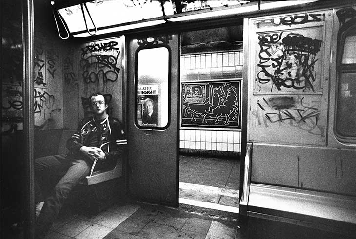
Keith Haring in a subway car in New York (c. 1983), Tseng Kwong Chi. Photo: © Muna Tseng Dance Projects, Inc. Art; © Keith Haring Foundation

Two of the subway drawings, almost six feet high, are hung near to the entrance of the exhibition. Haring produced hundreds of them, riding the length of the subway lines, drawing with white chalk on black paper sheets, and pasting these on blank advertising panels and over out-of-date ads. A photo by Tseng Kwong Chi from c. 1983 shows Haring sitting in a subway car, the interior wall of which is covered in graffiti artist tags. Through the open door of the car is one of the subway drawings: a line drawing of what could be an enormous computer-headed glow-worm, ridden by one of Haring’s trademark human figures. These figures are what most people would associate with Haring. These faceless outlines appear as if the visual elements of an infographic on the human population have escaped a textbook and run wild.
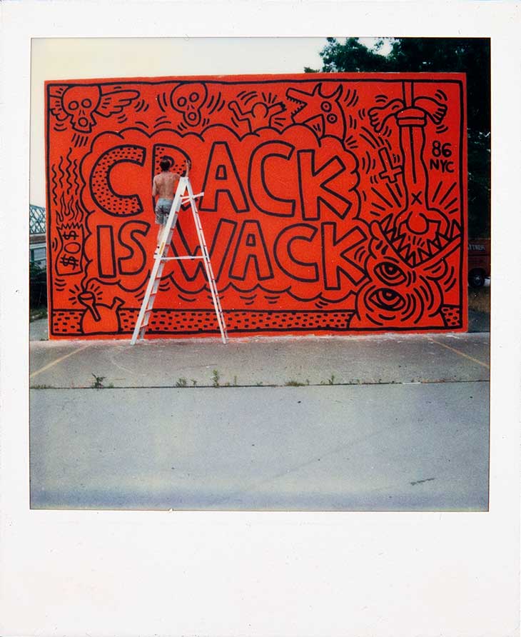
Keith Haring painting his Crack is Wack mural in 1986 in New York. © Keith Haring Foundation

Haring spoke a lot of how much he enjoyed making these subway drawings: ‘The whole thing was a performance. When I did it, there were inevitably people watching – all kinds of people.’ He preferred to leave it up to these people to project their ‘individual ideas about the given piece with no final meaning attached’ to the collection of symbols – from computers and TV screens to radiant babies and barking dogs – he provided. Is the figure on the glow-worm in control and enjoying his ride, or is he just clinging on to the beast? No matter how bizarre, these figures engage the viewer, drawing you in to the weird events depicted.
There was, however, little ambiguity when Haring had a particular issue he wanted to explore. Religion, which he believed had been used by Western society as a tool of oppression and control, is just one recurring theme. In one motif, he has a man hold a cross behind his back as he stabs another through the chest. On a tarpaulin painting from 1981, the black outlined characters are layered over the background of a blood-red cross.
Untitled (1985), Keith Haring. Installation view of ‘Keith Haring’, Tate Liverpool, 2019. Photo: © Mark McNulty

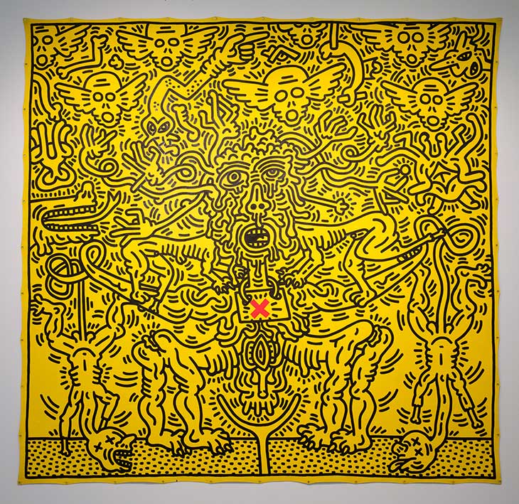
The final room of the exhibition focuses on Haring’s work around the AIDS epidemic, which claimed the lives of many of Haring’s friends and, in 1990, his own. Haring was prolific on the subject, producing designs for badges, posters and T-shirts to raise awareness as well as paintings and drawings on the topic. The last work we encounter in the exhibition is one of these: a yellow canvas almost 10 by 10 feet. It is filled to the edges not with Haring’s energetic figures but with winged skulls and emaciated, melting bodies with warts and misshapen genitalia, resembling those in a Victorian medical journal. Despite the gravity of the topic, Haring’s cartoonish style makes these easy to look at, be drawn in and empathise with the suffering portrayed. It may have been the artist’s lack of subtlety that annoyed Robert Hughes. But here, Haring’s directness, his ability to speak to an audience beyond the art gallery, reveals its value.
‘Keith Haring’ is at Tate Liverpool until 10 November.


