The second act of the ballet Giselle (1841) takes place in a woodland late at night. The spirit of Giselle, a village girl, returns to protect her lover Albrecht from the Wilis, shades of young women who died before marriage. There are many ways of representing forests on stage, but in Giselle the trees are traditionally painted as silhouettes on a cloth that is lit from behind to give an eerie glow. At the Royal Ballet’s recent production, using John Macfarlane’s designs from 1985, the mottled foliage and dark forms of the trees extended (or so it seemed) up and beyond the frame of the stage, fading to darkness as they went out of sight. The light appeared to diffuse from some distant source, the moon behind a cloud perhaps, and the effect of it through the semi-transparent brushwork produced an uncanny impression: I thought it was real. Or at least, I knew that what I was looking at was a clever combination of lighting, paint and dry ice; but I could not shake the conviction that it was tangible reality.
As in all good illusions, the scene worked because it followed rules that we perceive as structuring our visual world. It suggested depth; shapes lit and shaded to reveal form; an organic variation of tone; a harmonious sense of proportion. We have all experienced this sort of illusion at a pictorial level when looking at shaded patterns, like the rhomboid mosaic at Antioch, which we instinctively translate into a series of cubes. And we take for granted the coherence that allows us to recognise a pattern of shape and colour in a painting as denoting a room, or a boy, or a flower. But it is very rare now that we experience the natural extension of this, which scenographers and trompe l’oeil painters sought for hundreds of years – to convince us that the scene is as real as the world around us.
The art of the theatre mirrors the pictorial developments of its culture. But it has its own logic too, a logic that once pertained to many other forms of spectacle. Like a picture, the stage is a window into another world, but it has the complication of living participants and concrete props. As in mural painting, the harmonious incorporation of three-dimensional elements is the scenographer’s highest challenge. The real depth of the stage, unlike the two dimensions of the picture plane, only makes this harder: how can painted flats (as the large canvases and boards are known) compete with – remake – the actual space? The simplest way is to present the acting area of the stage as a piazza, with a building or colonnade (perhaps even an extension of the theatre) behind. One of the earliest examples of Renaissance perspectival scenery has survived at the Teatro Olimpico in Vicenza; the theatre was designed by Palladio, and the stage set created by Vincenzo Scamozzi in 1585, after Palladio’s death. Palladio had followed Vitruvius, but here the scaenae frons, which in Roman theatres was a real architectural façade, is a wood and stucco imitation of marble, through the archways of which the audience see several long, receding street views. In reality, these views take up only a few metres of stage space.
Such an achievement would not have been possible without an understanding of linear perspective, and its application to theatrical scenery grew increasingly refined as theatres became enclosed, the auditorium darkened and the stage space demarcated by the proscenium arch. A greater emphasis on illusion required that the stage become a world unto itself; one which could be managed from behind walls and screens. The space of the stage grew: whereas once actors had performed on the narrow area in front of the skene, the architectural backdrop (hence ‘proscenium’), now the area behind the skene was opened up, with additional picture planes provided by wings (the portions of stage scenery that can be opened and closed), eventually in four pairs. These could be used to create a staggered scenery combining actual and illusive depth.
Theatrical perspective with the symbolic monuments of Rome (n.d.), possibly Baldassare Peruzzi. Gallerie degli Uffizi, Florence
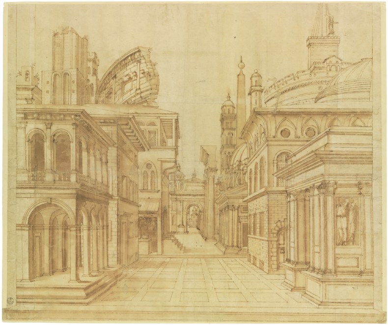
Writing of the innovative perspectival set created by Baldassarre Peruzzi for the comedy La Calandria in 1515, Vasari said: ‘It is wonderful how, in the narrow space, he depicted his streets, palaces, and curious temples, loggias and cornices, all made to make them appear to be what they represented’. Peruzzi used a set of wings decorated as houses to create an intermediate zone between backdrop and forestage; Vasari and others would extend this to a ‘continuous perspective, with all of the wings placed along two uninterrupted diagonal lines […] this innovation assailed the optical appearance of the scene, transforming the piazza into a wide street of accentuated depth and the real space into a depth intentionally illusive.’ As in other forms of 16th-century painting, clever imitation of surfaces went hand in hand with three-dimensional modelling. ‘The most remarkable part,’ wrote Vasari of Peruzzi’s set, was ‘a loggia facing the garden […] the decoration in perspective, formed of stucco and colours, is so excellent that even to artists it seems in relief. I remember that when I took the greater painter Titian to see it, he could not be persuaded that it was a painting.’
For around 300 years, from the early 16th century to the start of the 19th century, the majority of scenic designs included architectural elements – streets and buildings, which grew increasing fanciful and complex, and more partial structures: arcades, colonnades, balusters and balconies, porticos and courtyards, the vaults of dungeons and the galleries of royal palaces. Architecture is an extremely effective means of creating spatial depth, though we know that even a rural glade, like that in Giselle, can be made unnervingly lifelike. It is no coincidence that stage designers of the period usually had a practical knowledge of architecture, and would also oversee the building of theatres, which were often temporary structures erected in halls and courtyards. When theatres became enclosed, designers became masters of lighting too. Peruzzi’s student Sebastiano Serlio laid out his master’s rules for managing the illusion of space on the stage in his treatise Architettura in 1545, which was often invoked, and even combined with Vitruvius’s De architectura. Serlio’s book gave instructions and drawings for a stage we might recognise today. It was divided into two main sections, of which the foremost provided a piazza for the performers while in the space behind them the platform sloped upwards to the backdrop. Four sets of wings were arranged on the raked area of the stage – at first these were drawn back and forth manually, later by carts that ran beneath the stage – and could be used fully or partially, giving the performers a number of different sets within a show. (How this influenced playwrights and composers is an interesting corollary.)
Setting for a Comedy (1545), Sebastiano Serlio, from Den Ersten Boeck van Architecturen (Antwerp, 1558). McNay Art Museum, San Antonio, Texas
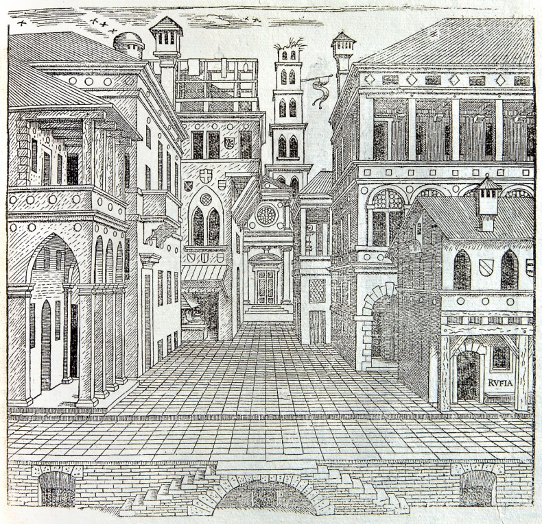
What we know about the design and operation of these sets, we know from accounts and treatises of the period, and from the very detailed drawings that survive. These were sometimes overlaid with diagrams showing how every aspect of the scene was aligned to a central vanishing point, the height of which would vary according to the space and, of course, the eyeline of the patron. But almost none of the actual scenery survives, and it is difficult to attest even to the pigments that were used. As in studio painting, the design and execution were not all carried out by a single hand. If anything, the separation between designer and painter came early to theatrical painting, which placed less value on marks of individual refinement. The size and speed with which scenes had to be realised – in the opera season new sets were required every few weeks – inevitably meant a number of artists working simultaneously.
The status of the stage designer was never as high as portraitists or painters of religious scenes, though they were in the entourage of all European nobility. Most courts looked to Italy – in Britain Inigo Jones created scenes directly from prints he had acquired in Rome – and designers liked Ferdinando Galli Bibiena travelled widely and were in great demand. Collectors, especially in the 20th century, recognised the drawings of Filippo Juvarra, Giacomo Torelli, the Bibiena and Galliari families as artworks in their own right. Their designs, like vedute paintings, often appeared to accurately portray scenes in the world but were full of subtle manipulations and exaggerations. It seems likely that the relationship between the stage and the studio was fluid, and that artists like Canaletto learned much from the innovations of stage designers, and observed at the theatre how light could transform a scene, how to place figures for maximum effect and how to manipulate perspective to heighten drama. All were working in a tradition of quadratura (illusionistic decoration), and while scenic designs have much to tell us about painting, contemporary paintings can suggest the effect of the flats we no longer have. In Veronese’s Feast at the House of Simon (1570) at Versailles, one is struck by the similarity to theatrical arrangements: there is a painted backdrop, through the architectures of which the scene recedes, and in the foreground the actors, who are much more defined, sit at ‘real’ wooden tables.
Sketch for the destruction of the palace of Armida, from ‘Armide’ by Jean-Baptiste Lully, c. 1686, Jean Bérain. Bibliothèque national, Paris
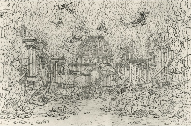
The art of scenic design is a point of continuity with a lost world of painted spectacle. European cities in the 16th, 17th and 18th centuries played host to all manner of pageants, plays and processions, festivals, oratorios, operas and ballets. Scenographers, or quadratisti, designed the physical structures, costumes and lighting, engineered the sometimes quite complex machinery of special effects, and were often skilled designers and painters of murals and other large decorative scenes. They were both machinesti and ornamentisti. The French designer Jean Bérain, forefather of rocaille, was responsible, in the late 17th century, for such diverse amusements as fêtes, carousels, spectacles de la cour, ceremonies, balls, fireworks, collations, pompes funèbres and illuminations in the galleries of the Louvre.
The treatises of such figures extended beyond the stage to discuss principles of perspective and the theories of architecture and engineering that underpinned their work. It is difficult though, looking at their drawings, to imagine the realisation of their designs on the stage and the effect of these carefully managed illusions. Diaries and letters provide us with accounts of the appearance of completed scenery, and, sometimes, the impression it had on the audience. Lady Mary Wortley Montagu attended the celebrations for the birth of Charles VI’s son in 1716, which included performances of the opera Angelica Vincitrice di Alcina, and wrote to Alexander Pope of the elaborate staging Ferdinando and Giuseppe Galli Bibiena had created: ‘The first act showed the palace of Alcina, sumptuously illuminated and raised up above a mine of gold and precious stones. The second act revealed two gloomy desert islands, separated by a canal […] In the distance could be seen a long stretch of sea with many ships, and in the centre a precipitous rock from which flames issued forth […] At the end of the act, the rock disappeared by dividing in half and changing into two ships.’ Some aspects of the huge repertoire of painted and mechanical techniques, like those suggesting weather and water, might now seem very unconvincing (wave rollers, for instance, and rippling fabric) but were once innovative and persuasive.
Scene design by Giacomo Torelli for ‘A deserted island with the Temple of Venus in the Sky’, Act II, Scene 3 in ‘Bellerofonte’, 1642, Giovanni Giorgi. Collection of the Tobin Endowment, San Antonio, Texas
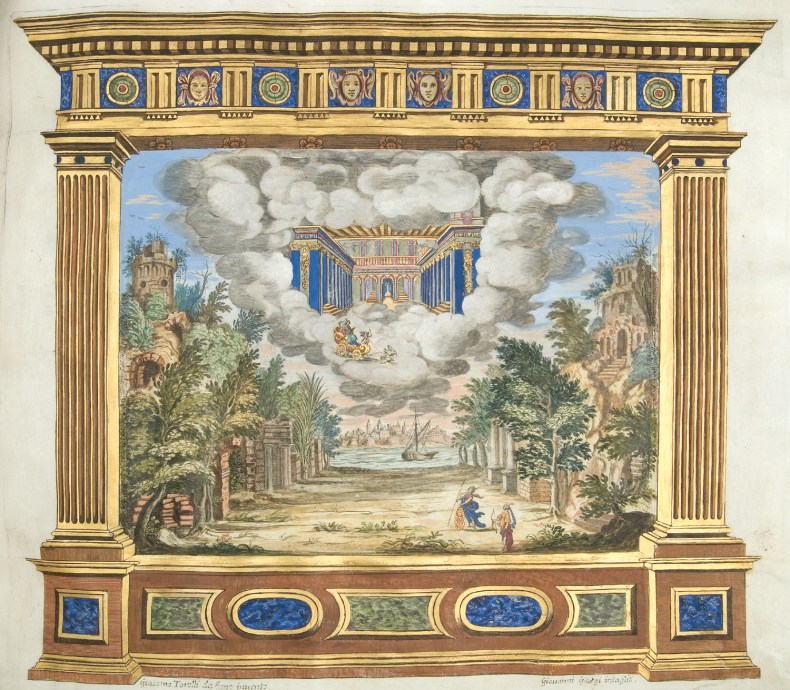
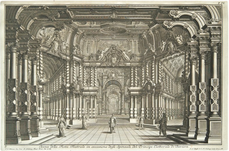
In illustrations of performances and coloured prints of scenery, such as Giovanni Giorgi’s etchings of sets designed by Torelli, we can see the variety of surfaces the scenic artist had to create: clouds, trees, stone, water, wood, brick, tile, and grand palace chambers of marble, stucco, and gold. Developments in perspective changed the ways in which audiences interpreted scenery, and by the end of the 17th century Italian designers were experimenting with diagonal perspective – or scena per angolo – which presented the audience with obliquely angled architecture and multiple vanishing points, meaning that the illusion of depth worked across the auditorium, rather than only in the centre. Baroque designs, such as Giuseppe Galli Bibiena’s Luogo Magnifico (1740), became so complex and wondrous that flying machines and other mechanical effects began to look outmoded: they couldn’t compete with the scenery. Often the actors couldn’t either. Inverting perspectival logic, designers constructed scenes that seemed to grow bigger as they receded, dwarfing performers. These new designs were of an architecture that could never be realised, preceding Piranesi’s fantastical prints. Painting techniques also grew more sophisticated, and throughout the 18th century the stage became a more painterly environment, as grotesque and implausible architectural scenes mutated into other sorts of exaggerated style and atmosphere. The shift wasn’t a rejection of illusion, though it drew new attention to artistic practice. In his Le scene del Nuovo Teatro del Verzaro di Perugia (1785), Baldassarre Orsini recorded the world of the theatrical designer and painter at the end of the 18th century, and gave the first really detailed account of scenic painting technique, repeatedly stressing the correct way to create shadows and highlights, and describing the use of sfumato and transitional passages to bring the whole stage picture into coherence.
Luogo Magnifico (1740), Giuseppe Galli Bibiena, plate from Architetture, e prospettive dedecate alla maestà di Carlo sesto. imperador de’ Romani (1740). McNay Art Museum, San Antonio, Texas
The secondary role the scene painter has often played to the designer means that much of their history has gone unrecorded, and without the flats they created we have nothing to analyse. But from what we learn from comments on scene painting and related disciplines, we can extrapolate the close relationship to contemporary ‘fine’ art practice, and a remarkable degree of continuity with the present day. There is much in a modern manual, like John Collins’s The Art of Scene Painting (1985), that would have made sense 300 years ago. Collins recommends pouncing to transfer an image from a scale cartoon, or gridding up the original drawing. The scenic artist at the end of the 20th century still depended upon their understanding of perspective and mathematical principles – Collins repeatedly describes scene painting as the art of enlargement. His method is reminiscent of Renaissance fresco painters: he recommends planning extensively then working quickly and lightly (both for the overall effect and to control the weight of paint on the canvas, minimising the effect of light on uneven paint surfaces), layering, using thinner tones on shaded areas to suggest the form beneath. He emphasises the necessity of being able to judge colour and tone in the wet. Stippling, hand splashing, scumbling and other techniques still in use today have a direct connection to the illusory art of the past, and have much to tell us about the effects created by scenic artists.
Anyone curious about the painterly art of scenography will encounter the dearth of pure literature on it. This reflects its status, the nature of its practice and of course the loss of its main artefacts, as well as much of the secondary material too. Discussions of the design and craft of scene painting are rarely combined in one work – Making the Scene (2010) by Oscar G. Brockett, Margaret A. Mitchell and Linda Hardberger is a notable exception – and the relationship to other disciplines has not been analysed in anything like enough depth. What we have are very good editions of scenic drawings, accounts of the French and Italian schools of designers, and of individual theatre companies (especially of the 20th century), treatises of great practitioners of the past, and more recent introductory guides that often double up as memoirs. Actual practice inevitably preceded its written description, and the story of scenic art is one which requires both detective work and imaginative leaps – an intriguing position, because it forces us to confront the ways of looking that we have inherited and those we have abandoned.
Though no one could tell, I was rather embarrassed by what felt like a childish surrender to the techne of Giselle.
It is a relief to find in Ernst Gombrich’s writing the argument that all pictorial space (including, I suppose, our experience of the world around us) is made ‘real’ out of a very necessary desire for coherence. We do not like visual ambiguity. ‘This is the reason,’ Gombrich writes, ‘why people are generally puzzled if they are told that any correct rendering of perspective may stand for an infinity of shapes in space. It strikes them as perverse to insist that, say, the houses in Canaletto’s view of Venice [Campo San Zanipolo] might be imagined as standing at any angle and distance from the beholder.’ If theatre designers have not been convincing us with the totality of their creations, it is because such complete deception is no longer always an object. The late 19th and early 20th centuries saw scenic art abandon illusion in favour of other kinds of effects; many designers attempted to destroy the simulation of reality audiences expected, and to point out the artifice. But that does not mean that the scenes they created also abandoned the principles that could be exploited for such illusions. There are many forms of theatrical convention that we today accept unquestioningly and which will no doubt look quite different in 50 years time. Who is the person that can see through them? ‘It is quite possible that only a stage designer,’ Gombrich writes, ‘or at least a person accustomed to moving on an illusionist stage, would be able to perform the necessary switches and really “see” the ambiguity.’
From the July/August 2018 issue of Apollo. Preview and subscribe here.


