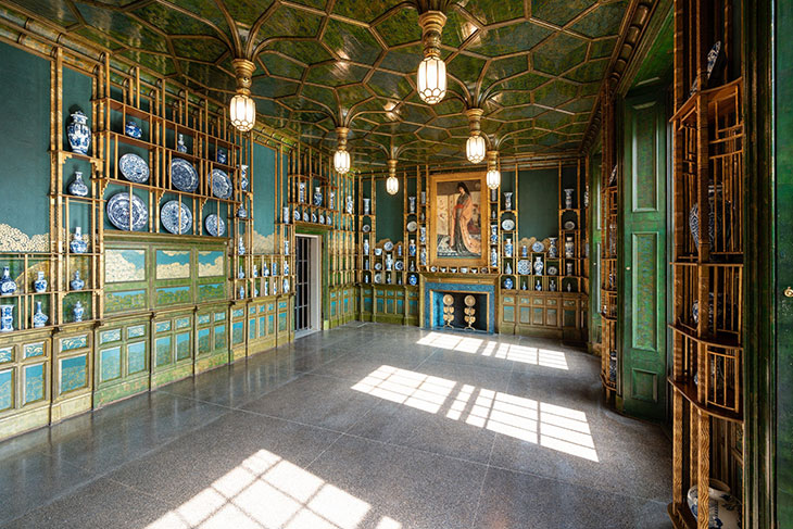
Oscar Wilde had it in for wallpaper. There are, of course, those famous last words, uttered from his deathbed in a cheap hotel on the Left Bank in Paris: ‘My wallpaper and I are fighting a duel to the death. One or the other of us has to go.’ A typically frivolous Wildean witticism, perhaps, but over the years the writer had dedicated a good deal of serious thought to the question of interior decoration. In 1882, delivering a lecture on ‘House Decoration’, he had told a US audience: ‘You have too many white walls. More colour is wanted. You should have such men as Whistler among you to teach you the beauty and joy of colour […] I regard Mr Whistler’s famous Peacock Room as the finest thing in colour and art decoration which the world has known since Correggio painted that wonderful room in Italy where the little children are dancing on the walls.’ Wilde even went so far as to suggest, in another lecture that year, that trompe-l’oeil wallpaper could have a corrupting influence on young, impressionable minds. ‘How can you expect them, then, to tell the truth if everything about them is telling lies, like the paper in the hall declaring itself marble? Why, I have seen wallpaper which must lead a boy brought up under its influence to a career of crime.’
Installation view of Whistler’s Peacock Room at the Freer Gallery of Art, Washington, D.C., photographed in 2019

In these days of confinement, we are having to face – quite literally – the decorative choices we have made, or that have been made for us, or not made at all. How soon each of us will be crawling the walls will be in some part determined, we are led to believe – and personal empirical evidence would certainly support this – by the pattern or pigment thereon. ‘Show me nothing that looks like gravy,’ Dorothy Draper used to instruct her design minions. The decorating doyenne felt instinctively what theorists and scientists before and since have suggested, that ‘lovely, clear colors have a vital effect on our mental happiness’. Certainly her offerings had an effect on the American pocket: her trademark cabbage-rose chintz is said to have sold more than a million yards, much of it during the Great Depression.
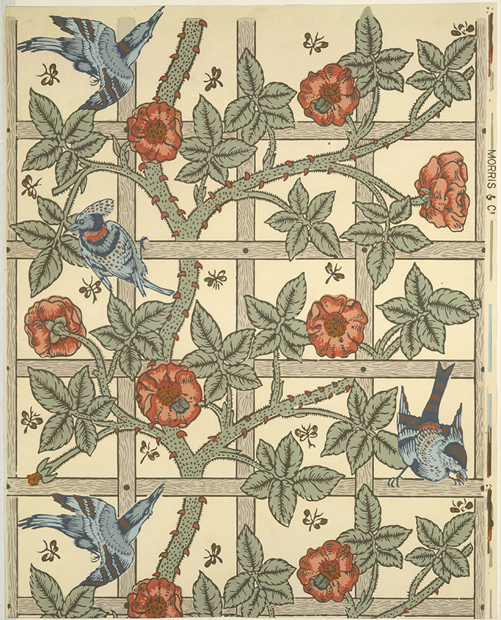
The term ‘biophilia’ was first borrowed by a biologist in 1984, giving a name to the behaviour that humans – and the artists and designers among them – have been displaying since time immemorial. That tendency we have to seek out the natural world, particularly in times of crisis, accounts for the surfeit of missives from PR companies at the moment, exhorting us to ‘bring the outside in’. William Morris didn’t need telling. His first paper, ‘Trellis’, designed in 1862, was inspired by the rose trellises in his garden at Red House in Kent. Since then, walls the world over have been rampant with his stylised floral motifs, ‘Willow Boughs’ (1887) evidently a perennial favourite in recent years. Like Wilde, he too seemed to be against overly fictive decoration, lecturing in 1881 against ‘sham-real boughs and flowers, casting sham-real shadows on your walls […] You may be sure that any decoration is futile, and has fallen into at least the first stage of degradation, when it does not remind you of something beyond itself, of something of which it is but a visible symbol.’ (And yet, despite being an admirer of Morris – his house in Tite Street boasted blue-and-white curtains by the designer – Wilde was still not persuaded by his wallpapers, writing to the designer W.A.S. Benson in May 1885: ‘he is far more successful with those designs which are meant for textures which hang in folds […] when everything is covered with a design the room is restless and the eye disturbed.’)
Wallpaper design, ‘Trellis’ (designed 1862, first produced 1864), William Morris. Metropolitan Museum of Art, New York

One wonders what Morris and Wilde might have made of what is surely the most delightful example left to us of ‘bringing the outside in’: the frescoed subterranean garden room from the Villa of Livia (c. 30 BC), discovered at Prima Porta, on the periphery of Rome, in 1863 and now housed in the Palazzo Massimo. Somehow at once stylised and naturalistic, manicured and wild, exuberant and meditative, its walls all but dissolve, and you can very near taste the pomegranates, and hear the birdsong and the breeze rustling the oleanders.
A wall painting in the underground ‘garden’ dining room of the Villa Livia. Photo: Francesco Bini/Sailko

Goethe, who published his Theory of Colours in 1810, would certainly have approved of the scheme’s cool blues and greens. His theory assigned particular qualities to colours in the prism, red being ‘beautiful’, orange ‘noble’, yellow ‘good’ and violet ‘unnecessary’. Different rooms were to be decorated accordingly, and in his own homes in Weimar, blues (‘mean, common’) and greens (‘useful’, and the most welcoming colour) prevail. Viridian green was a favourite of Virginia Woolf, and makes her sitting room at Monk’s House in East Sussex unforgettable, once seen. What a pity her sister, Vanessa Bell, soured her enjoyment of the colour by mocking her fondness for it. Woolf felt an ‘irrational pain’ and ‘sense of failure’ as a result.
Goethe’s colour wheel, designed in 1809

Arbitrary colour hierarchies in decoration have long been in evidence, then. At Ashcombe, the house he rented for many years in Wiltshire, the waspish Cecil Beaton had a blank canvas on which to encourage an altogether different kind of hierarchy. His bathroom became a visitors’ book writ large as he encouraged first-time house guests to trace the outlines of their hands on its walls: ‘As one lay sousing in hot water one could ruminate upon the characteristic traits shown in these significant and lifelike shapes and in the choice of position or proximity to others chosen by their owners on the wall, and later, on the ceiling.’ He was even more delighted when friends including Rex Whistler, Oliver Messel and Lord Berners helped him paint his bedroom ‘in garish colours’ on a circus theme. When Whistler repainted a ‘slapdash’ strong man daubed by Yorck Bismarck, Beaton gleefully recalled, ‘a nasty situation was created in the artistic world, of which reverberations were heard for many weeks to come’.
Surroundings once deemed beautiful, of course, can turn on us – a case of our mental state affecting what we see, rather than the reverse. Witness Dorothea in Middlemarch, for whom the once beguiling blue-green boudoir in her marital home takes on a spectral aspect when the reality of her married life to Casaubon has hit home: ‘the stag in the tapestry looked more like a ghost in his ghostly blue-green world’. (In that same century, walls literally turned toxic, thanks to the arsenic used in shades such as Scheele’s green and Emerald or Paris green; Morris’s family fortune, incidentally, came from an arsenic mine in which he held stock for a number of years.)
Nancy Lancaster’s Yellow Room at 39 Brook Street in Mayfair. Photo: Simon Upton; courtesy Colefax and Fowler

Yellow seems to be a particularly treacherous colour. It can be joyful – the colour of sunshine, of golden days and memories, buttercups and straw or, in the case of Monet’s dining room at Giverny, like being inside an egg yolk. Or how about Nancy Lancaster’s famous Yellow Room in Mayfair, created in 1959 with John Fowler and glossed with layer upon layer of what the American decorator called ‘buttah-yellah’. Get it wrong, however, and it becomes sickly, sulphuric, and sinister. Commentators have read in Charlotte Perkins Gilman’s short story ‘The Yellow Wallpaper’ (1892) a critique of Morris and the Aesthetic movement, among more conspicuous feminist ideas. The narrator is a woman suffering, probably, from post-natal depression, and confined by her physician husband to an upstairs nursery room of a mansion he has rented for the summer. She becomes obsessed with its peeling wallpaper, ‘one of those sprawling flamboyant patterns committing every artistic sin […] The color is repellent, almost revolting; a smouldering unclean yellow, strangely faded by the slow-turning sunlight’. Later, in an increasingly febrile state, she describes the pattern as ‘an interminable string of toadstools, budding and sprouting in endless convolutions’. The paper even gives off ‘a yellow smell’.
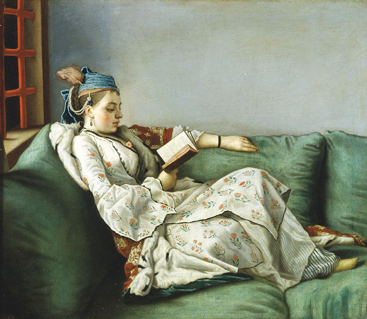
Portrait of Maria Adelaide of France in Turkish-style clothes (1753), Jean-Étienne Liotard. Uffizi Gallery, Florence

When it comes to choosing colours for our walls, much is in a name. It was John Fowler who concocted many of Farrow & Ball’s paint pots, and gave them their eccentric titles. I suspect that, in weeks to come, the firm might see fewer sales of ‘Dead Salmon’, ‘Railings’, ‘Salon Drab’ and ‘Sulking Room Pink’ (though have I hit upon a new self-isolation parlour game?), and more of ‘Picture Gallery Red’, ‘Dutch Orange’, ‘Borrowed Light’, ‘India Yellow’… I write this in a room painted in ‘Turkish Blue’. Thanks to its name, no doubt, it reminds me of a particular turquoise in paintings by Liotard – the subject’s headdress in Marie Adelaide of France in Turkish dress, the painter’s cuff in his self-portrait of 1749. In the absence of real voyages – or at least the vistas afforded by panoramic wallpapers from the likes of Zuber – it has a much-needed whiff of the exotic, and the far-flung. As Diana Vreeland said, the eye has to travel – if only, for now, as far as my dado rail.


