The Clark Art Institute has been shortlisted for the Apollo Museum Opening of the Year Award 2014.
On 4 July, the Clark – one of North America’s premier research institutions with its own on-site museum – inaugurated its elegant new and renovated facilities. They include Tadao Ando’s transformative new extension and Annabelle Selldorf’s rethinking of the museum and research centre buildings, as well as the reorientation of the whole institute to make it knit with its sublime 140-acre campus in the Massachusetts countryside. […]
It began with the masterplan to reconceive the campus, created in 2001 by Cooper, Robertson & Partners. The project looked at the most successful way to develop it – the geological study revealed which woods were new and where streams flowed into wetlands, helping the Clark to build responsibly, working with its natural environment. For instance, when the Clark chose Tadao Ando to design the grand plan’s first new building, Stone Hill Center, home to the Williamstown Art Conservation Center (WACC; completed 2008), some trees could be felled because historically the site had been a field. […]
The Stone Hill Center houses the Williamstown Art Conservation Center. Designed by Tadao Ando, it opened in 2008. Courtesy Clark Art Institute. © Jeff Goldberg/Esto

‘Make it New’ – Highlights from The Clark’s latest exhibition
The challenge,’ Conforti believes, was one of ‘an institution with a programme need against an architect with a spatial need. There are tensions. We also have the landscape.’ Ando understood Conforti’s dream and saw it as ‘a unique opportunity for people to be able to see art in this wonderful setting…What could be better than to see the art and also the associated changes of the four seasons at the same time?’ For his part, Conforti says that there were three principal reasons for the committee choosing Ando.‘He was willing and able to work underground to bring in natural light because we needed space with minimal impact on our landscape. He could embrace our landscape. And he has the vocabulary to unify our two discordant buildings, the neoclassical museum and the granite research centre.’ While they did not want ‘a statement architect’, as Conforti puts it, they did want a building strong enough to ‘survive as an element of architecture’ if there were no people in it. He concludes: ‘Mr Ando was absolutely that person.’ […]
Ando’s structure is apparently simple, a collection of beautifully proportioned, light-filled rooms carefully arranged on the ground floor and in a basement. Two thirds of his building is below ground level, lit by shafts of light flooding into large light wells. His materials are the granite plus glass, aluminium and just a little of his trademark concrete for architectural flourishes. But this belies a considerable complexity in vision and function. The Ando building functions as the approach to the whole institute, as a complement to the museum it abuts, as the third of the institute’s trio of big buildings, as an introduction to the landscape, and as a building in itself. ‘As you go through it,’ says Conforti with evident excitement, ‘it’s a building that only reveals itself by experience, like a labyrinth. Yet it is seamless.’
Ando’s building and his exhibition spaces offer what senior curator Richard Rand calls ‘dynamic excitement compared to the stability of the permanent collection’ housed in the reworked museum next door. The museum’s renovation is successful thanks to an equally strong, but distinctly different, collaboration between curators and architect, this time Annabelle Selldorf in New York.
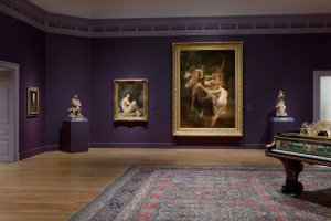
Inside the museum building. Photo: Mike Agee

As Conforti puts it: ‘The Ando is a great construction. Annabelle’s work is a great rethink.’ He adds: ‘People love our “white building”, as we call it. They love the domesticity – it’s like a house museum with views of trees and the pond. It’s not an architectural gem but we could not spoil
it. Annabelle has the classical discipline, vocabulary and appreciation to bring a modern touch to a neoclassical building.’ She was also ingenious. ‘She made galleries out of hallways, changed the lighting, took the familiar and made it better with a delicate modernism; she reconfigured old galleries and added much-needed infrastructure.’ And she changed the display cases. ‘The minute I came in the ’90s I wanted to change them. Needless to say, I didn’t,’ Conforti laughs. ‘Perhaps I had my long-term strategy even then. The worse things become, the better the argument for changing them.’
Selldorf began her work here in 2007, with the motto ‘Make it look better without anyone noticing what you have done. This is the jewel in the campus.’ Morris and Rand badly wanted better circulation. So Selldorf reoriented the galleries on to an east-west axis ‘to give the collection the best show’, she says, and make a logical circulation with options ‘so it’s not coercive’. Entry is now straight to a wall of Winslow Homer pictures ‘because the public loves them, and they are great’; then there are choices. Critical was the central, top-lit Impressionist Room – ‘sooner or later you cannot help but come upon that’ – here are displayed selections that include 10 Monet canvases and 32 works from what is one of America’s finest Renoir holdings. […]
The new extension to the Clark, designed by Tadao Ando, opened alongside Annabelle Selldorf’s refurbished galleries on 4 July 2014.
The Clark Art Institute has been shortlisted for the Apollo Museum Opening of the Year Award 2014.
This is an extract from Apollo’s July/August issue. Click here to subscribe.
Clark Center and reflecting pool. Photo: Tucker Bair


