Jeffrey Gibson
While this year’s Venice Biennale was full of exciting work, there was not much that could be described as joyful. One obvious exception to this rule was the US Pavilion. Under the title ‘the space in which to place me’, Jeffrey Gibson brought beads, beats and brightness to the frequently sombre Giardini. Space – as the title of his pavilion suggests – is important to Gibson. In an interview for the Biennale, he described how being part of a minority culture is to feel ‘on the periphery of the mainstream […] not centralised’. Gibson is the first Indigenous artist to be shown on their own in the US Pavilion. He is also queer. The sense of belonging, an awareness of exclusion and attempts to wrestle mainstream attention on to his work have all been part of his practice. Earlier this year, in an interview for Apollo, he told Jane Morris that he had considered leaving the art world in 2011. ‘It all had to do with homophobia, racism and classism, specifically in the art world, and how challenging it was for me to engage in it,’ he said.
Gibson filled the pavilion with 23 new works, among them punching bags – a familiar motif from his oeuvre that came about as he was working with a therapist to process anger – as well as beaded animal heads and ancestral figures. The entire pavilion was brought together through Gibson’s typically bold use of pattern and colour. Colour, for Gibson, is a way of combating the traditional ‘whiteness’ (in many senses) of Western art history, where the primacy of modernism supports a privileging of blank space. Overlooking colour has been a way of overlooking both Native American art and queer art. ‘We’ve been dismissed as garish and too much, because of our use of colour,’ Gibson told the New York Times earlier this year.
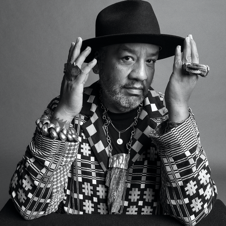
Jeffrey Gibson photographed by Inez & Vinoodh. Courtesy Hauser & Wirth

The work on show was remarkable for its detail. The starting point for the pavilion was nothing less than the US Constitution. He wanted, he said, ‘to map out some moments in American history when there is this real promise of equality, liberty and justice’, but what first hit me, upon entering the pavilion, was the intricacy of the work, even to the point that he designed his own typeface for works which quoted the Constitution. While the intellectual underpinning for taking on the shape of letters is, in some ways, obvious – one way to ensure that the rubric of lawmaking works for you is to own the tools designed to define it – it also spoke to the extraordinary complexity of his work. As he says, ‘I think we [Native Americans] have always made these incredibly beautiful, crafted, laborious, time-consuming things. And you think, why? You know, and I realised that when you’re making an object, we’re making spaces of freedom. We’re making spaces of hope in these objects.’
While Gibson’s concerns might be deeply involved with the myths of America, he is in many ways an international artist. He grew up in the United States, Germany and Korea, and trained not only at the School of the Art Institute of Chicago but also at the Royal College of Art, London. This could be why his work seems so broad-minded and open, and perhaps why his work is so successful internationally. This year, Gibson, as well as exhibiting in Venice, had his first solo exhibition in the UK: ‘no simple word for time’ at the Sainsbury Centre in Norwich, where he gamely explored what truth is with characteristic brightness. He also created the immersive installation POWER FULL BECAUSE WE’RE DIFFERENT at MASS MoCA, which is on show until 2026. Now that Gibson’s particular way of challenging histories is at the centre of the international art world’s eye, it’s going to be hard to dislodge him – an idea that comes with its own particular sense of joy.
Installation view of ‘the space in which to place me’ (2024) by Jeffrey Gibson at the US Pavilion at the 2024 Venice Biennale. Photo: Timothy Schenck; © the artist

Edward Behrens is editor of Apollo.


